After been tasked to look into HUDs (heads up displays) and interfaces that will be used within the film I started to look up interfaces to get inspiration and an idea of how or what they looked like and how to animate them.
When looking around for interfaces I first came across this montage of interface designs from the film OBLIVION.
Personally what I really like about this interface design and animation is that its quite fluid and really suits the style of the film and how its not just all square boxes there is a variation of shapes i.e. circles, triangles, diamonds and rectangles. As well the animation of all of the interface designs are creative and smooth, as well what I really liked was that they added in small little flashing dots and moving around which looks really futuristic and advanced.


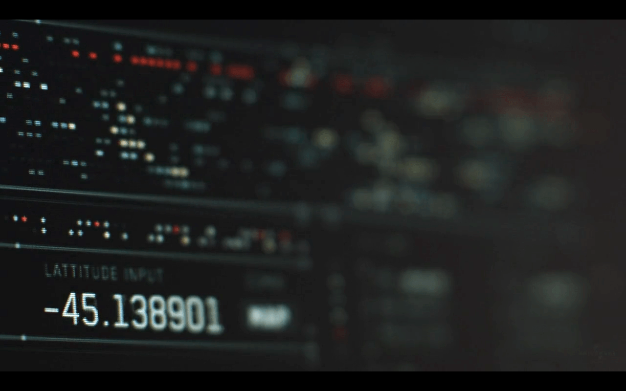
I feel after watching this montage of animations of interfaces I would like to take inspiration from how crisp and how detailed the whole interface looks and how they used different shapes and not just one shape throughout.
I then started looking further into more sci-fi films that are interface heavy to see what kind of designs of interfaces they have which made me come across Guardians of the Galaxy created by Territory Studios.
What I really liked about this interface was how the motion of the animation moves around and in a way spreads across the screen.

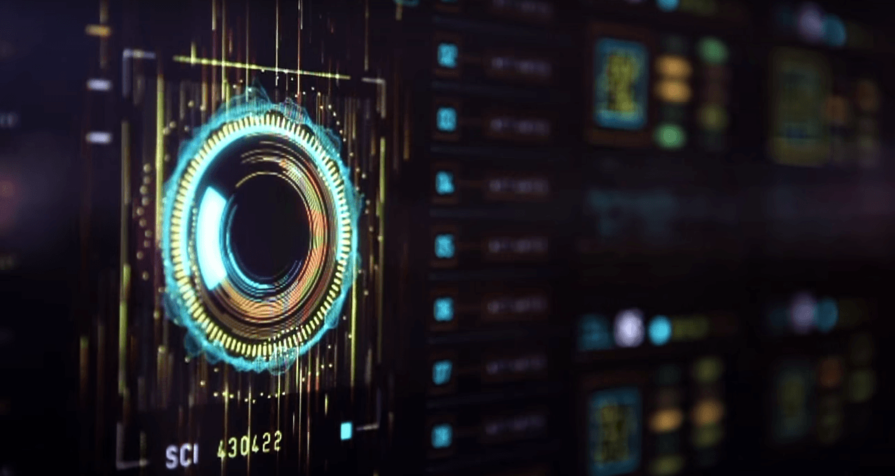

With Guardians of the Galaxy user interface its very futuristic and alien like, obviously I don’t want to be using the very futuristic look and spaceship style of the user interface but I do really like the animations and the motion of the shapes and text that they used throughout the showreel, as well how things pop up or appear.
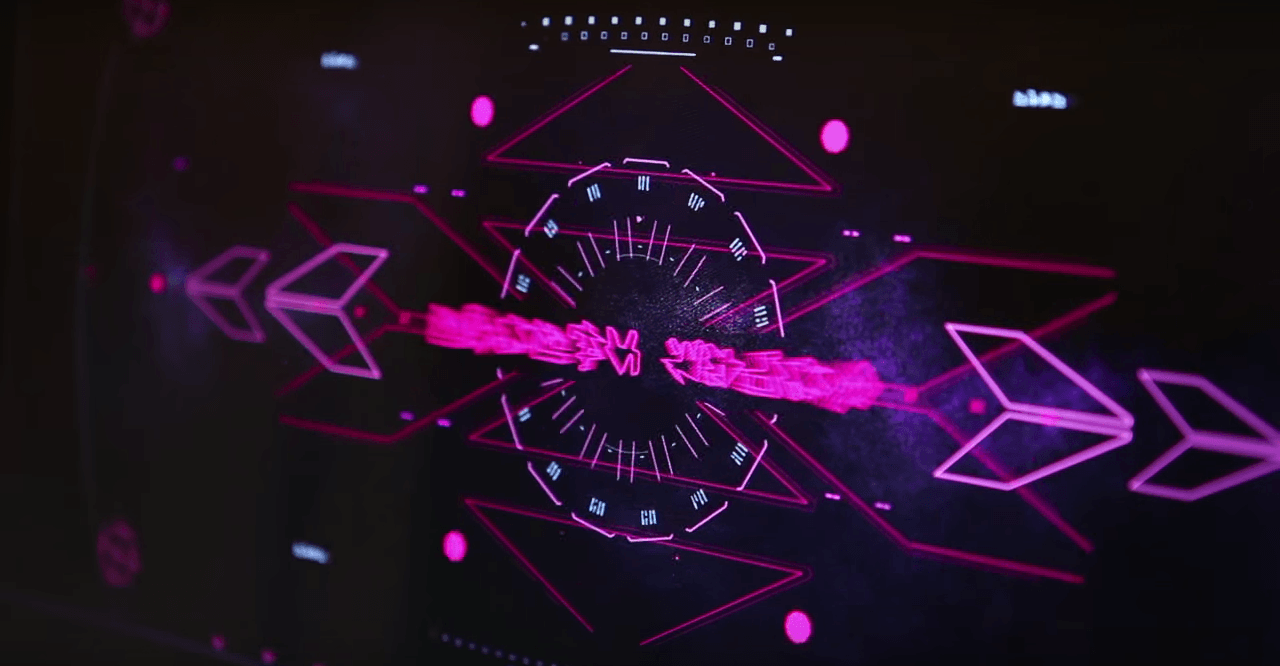
Out of my curiosity I started to look into Territory Studios just to see what they do and what they cover. I found out from when I accessed their website that they are actually an independent studio that covers Design, motion and digital media I then looked through their motion tab and found their portfolio of work that they have done for clients films such as Avengers Age of Ultron , The Martian and Prometheus and they have done all of their user interactions interfaces (UI). while going through their portfolio I then came across the film Jupiter Ascending where they have once again done the user interactions interfaces.


I really like their style, animations, colour plate and the movements they created for both Jupiter Ascending and Guardians of the Galaxy I can see some similarities with the idea of movement with animations and very colourful colours that grab your attention and the animations are hypnotic to watch.
Personally to me these are the standards I am going to have to live up to, to make sure that they look visually striking and attractive to see and watch, animations are smooth and swift and designed correctly so that they suit the world
Leave a comment